Summary
During my time as a Senior Product Designer at BPP, I led strategic UX/UI design work and strengthened the organisation’s design system capabilities.
My role blended user-centred design, collaboration with cross-functional teams, and design system leadership to improve core product experiences and support scalable design practices across brands.
Key contributions included:
- Leading UX/UI design initiatives informed by both qualitative and quantitative data.
- Partnering with researchers, analysts, product managers and developers to align design decisions with evidence and business goals.
- Developing and governing a multi-brand design system that improved consistency and efficiency across digital products.
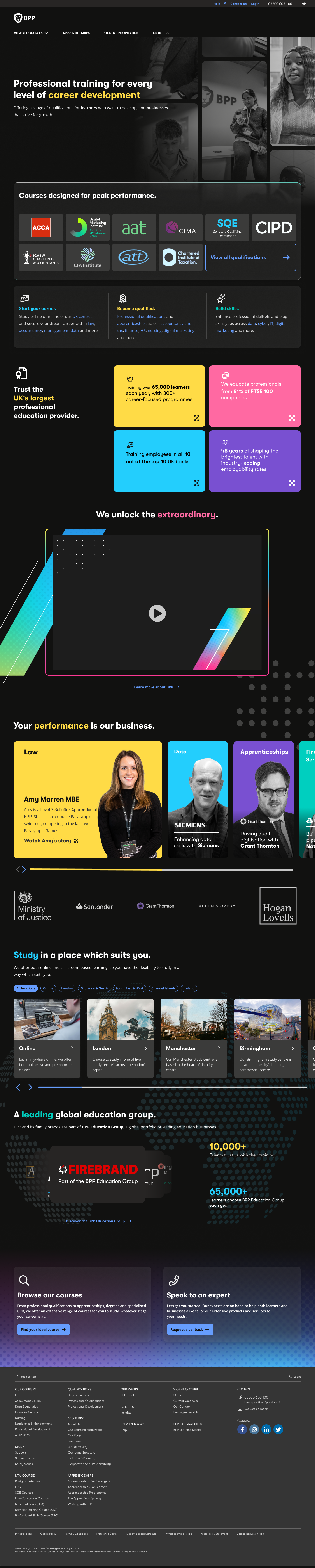
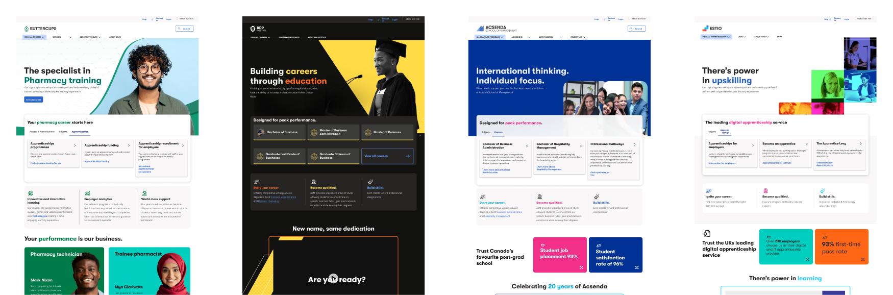
Homepage & Navigation Redesign
Challenge
The existing homepage was underperforming in helping users discover BPP’s offerings and understand the brand in a way that encouraged deeper engagement.
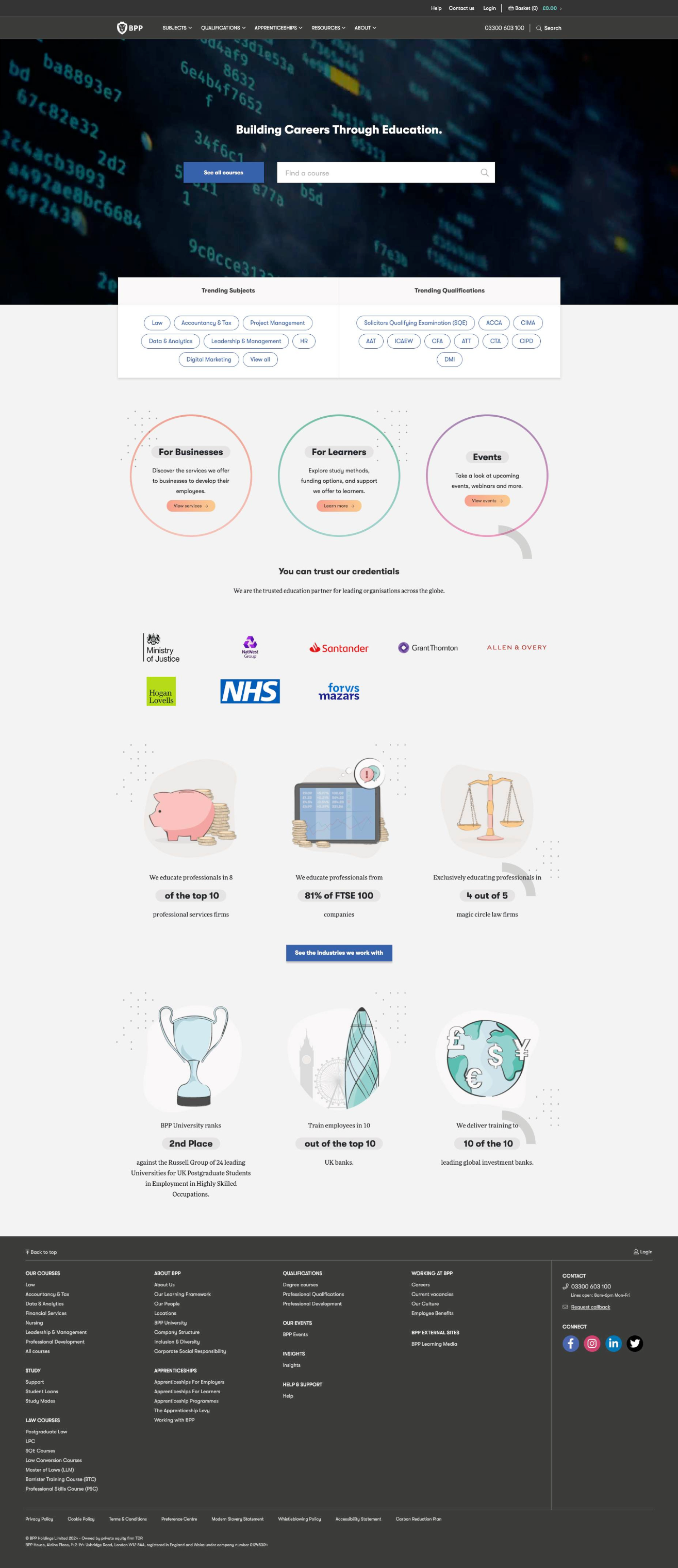
Approach
We began with baseline analysis using user interviews, Google Analytics and Lighthouse metrics to understand how users interacted with the homepage. From this data, I defined three clear success themes:
I facilitated a cross-team workshop with Marketing and Business Analysts to prioritise solutions. Using a Venn diagram helped visualise which ideas would best address user and business needs.
Once aligned, I created low-fidelity wireframes, presented options to stakeholders, and refined the chosen layout into a high-fidelity design using the Scholar Design System.
Outcome
The redesigned homepage improved clarity of purpose and made key actions easier to find. Early feedback has shown users are better able to understand BPP’s core offerings and navigate to relevant areas of the site.
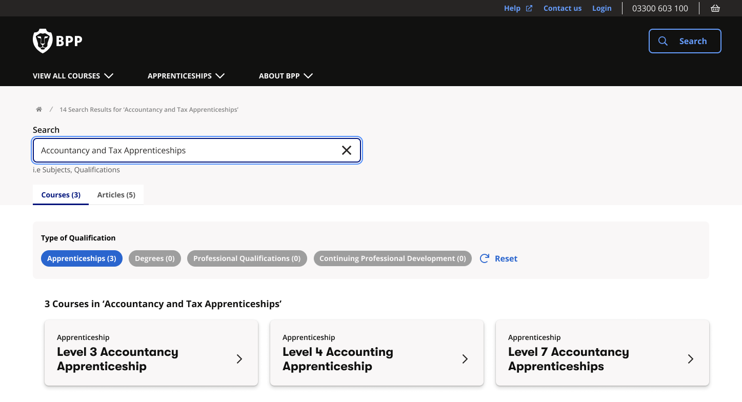
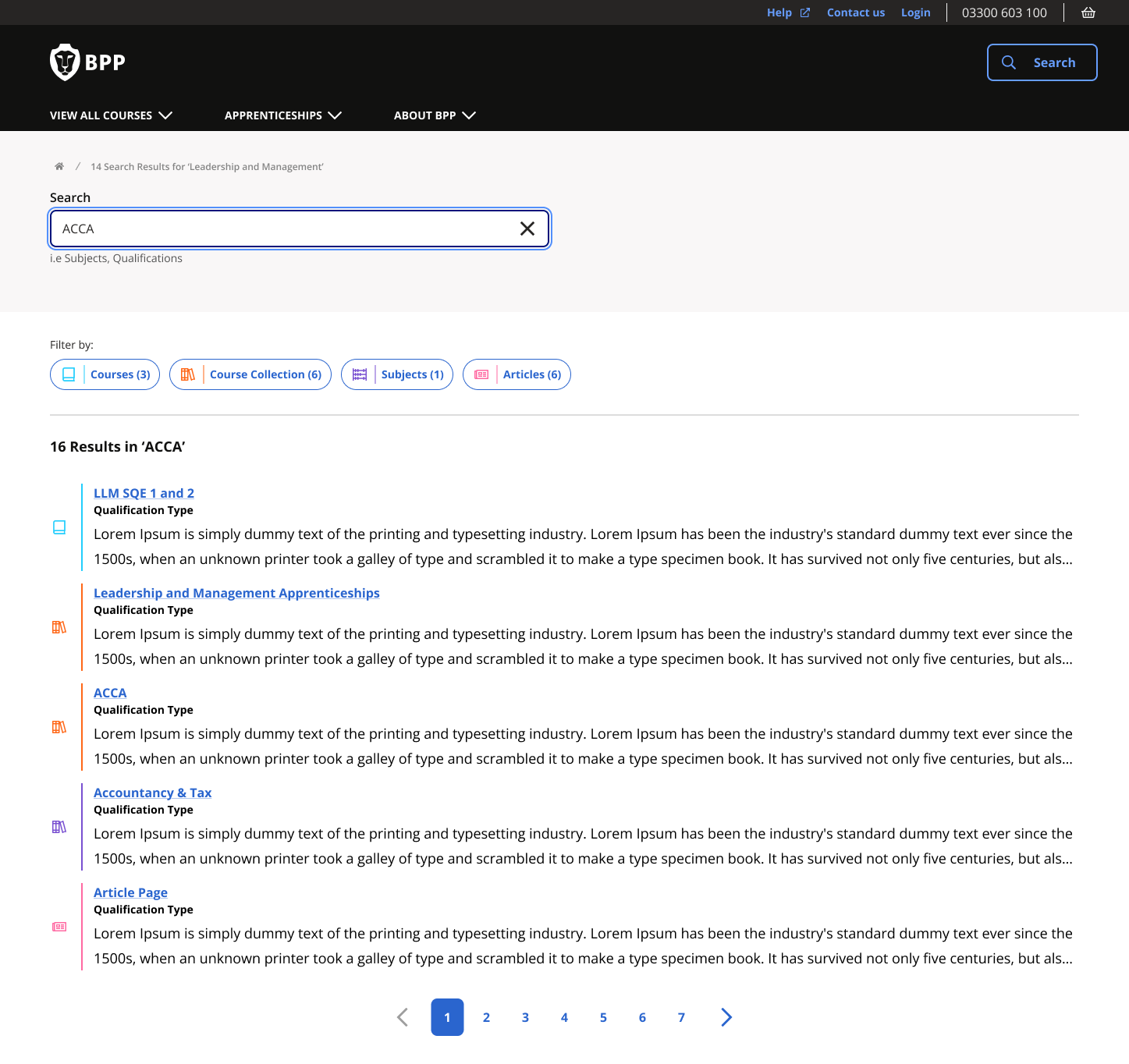
Product Search Page
Challenge
The search experience saw high traffic but low conversion - many users returned to the homepage or refreshed the page, indicating they were not finding what they needed.
Approach
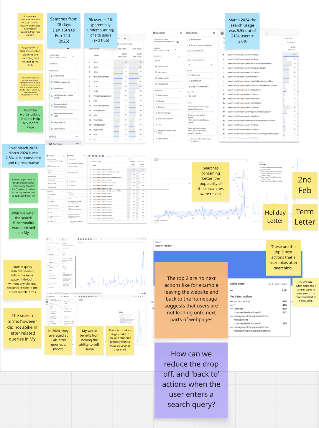
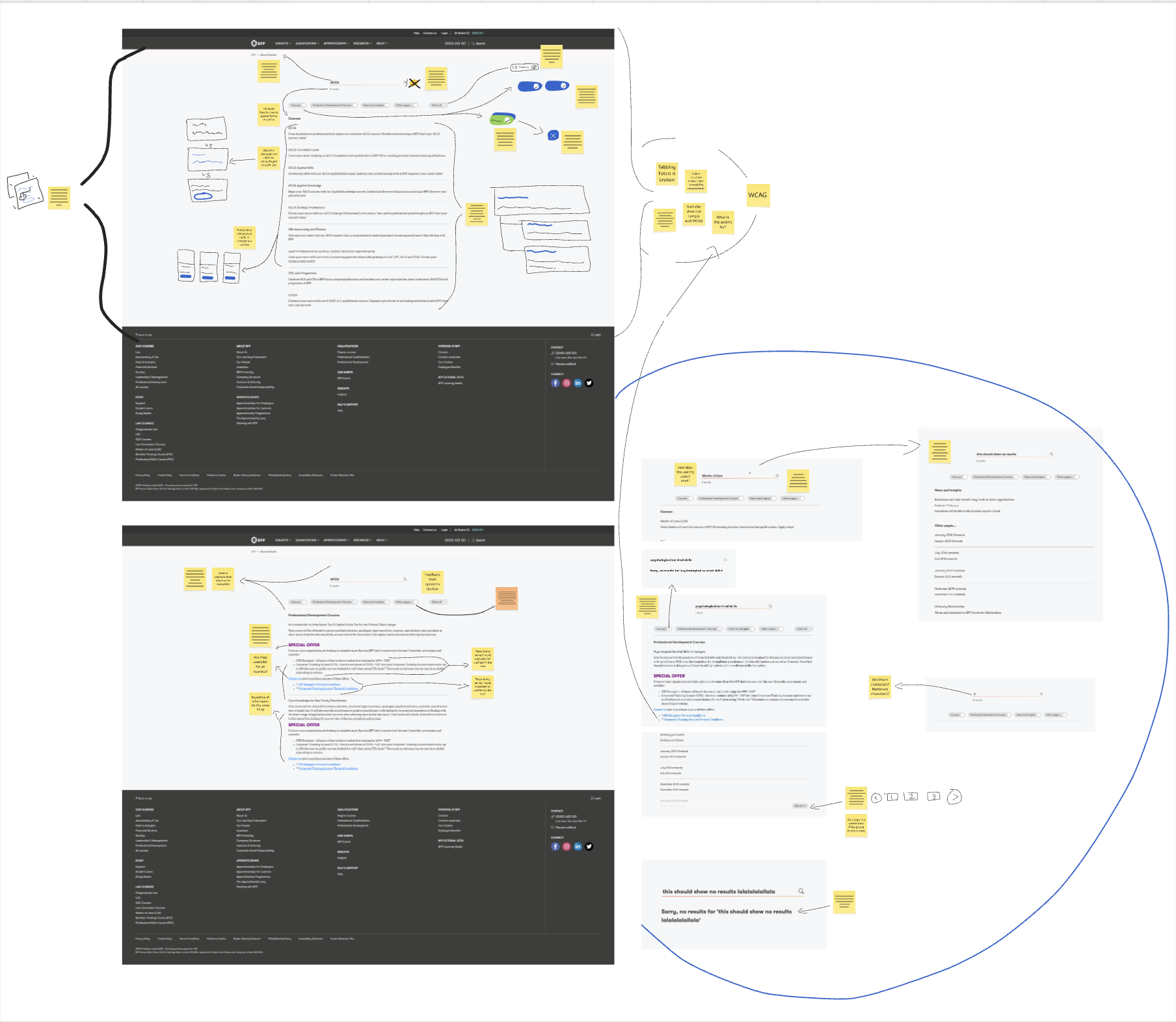
I analysed search behaviour, query patterns and interface issues to diagnose root causes. Findings showed the legacy search did not deliver relevant results consistently, due partly to outdated technology and limited filtering options.
Collaborating with stakeholders, we hypothesised improvements, including:
- improving relevance through better result organisation,
- introducing clearer visual cues and metadata,
- aligning the UI to accessibility standards and design system components.
Designs were prototyped with structured content chips and hierarchy to help users scan results more efficiently.
Design
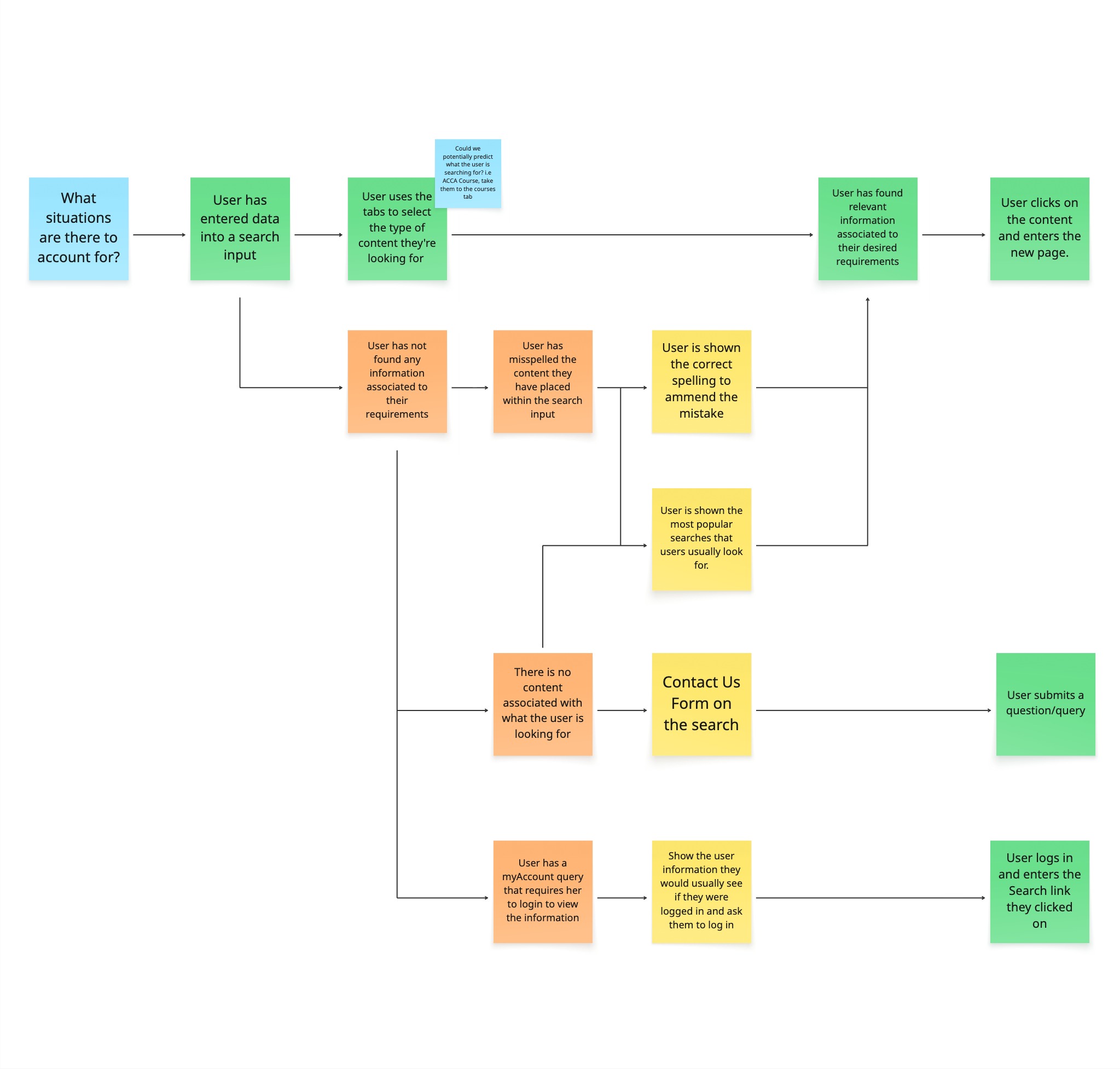
I had established to stakeholders the considerations required when designing a prototype for the search page. We needed to identify key pain points that the user would encounter as well as an ideal journey we want the user to persue.
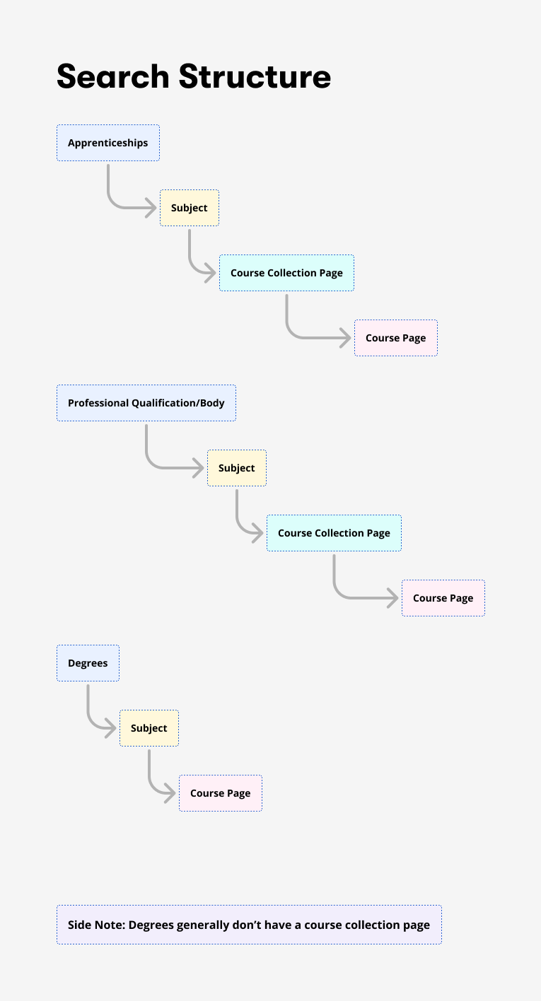
I also identified the structure of pages, this helped construct the visual representation of our data on the search pages, allowing us to add information chips to reinforce the user's decision to click the appropriate content.
Variation of Designs Suggested:
Card Style -
- Utilises space to make comprehension of data digestable.
- Uses grey and white space to prioritise the users focal point to different areas of the page.
- Using meta-data to allow the user to find the right information.
Link Style -
- Utilises as much available space to present details of the course, very similiar systematic presentation to the most popular search engines such as Google.
- Using iconography and colour to distinguish between the different types of content.
- Removing tabs to understand the necessity and impact of this level of filtering to the users search performance.
Outcome
While final analytics are ongoing, initial observations show a decrease in users returning to the homepage after reviewing search results through the Link style outcome and quicker access to key resources such as articles and key exam dates.
Scholar Multi-Brand Design System
Modern product teams require scalable design systems that support both design and development. My personal ideology for design systems are that the tools don't define a great design system, it is the articulation qualty of data-driven communication between design and development decisions escelating up to the business needs.
Scholar Analytics Dashboard
Challenge
The design system lacked quantitative measurement tools, making it difficult to understand usage patterns and inefficiencies.
Action
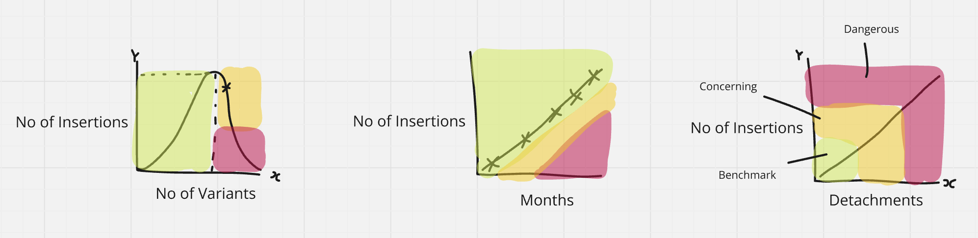
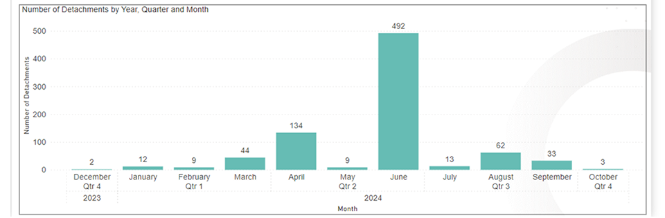
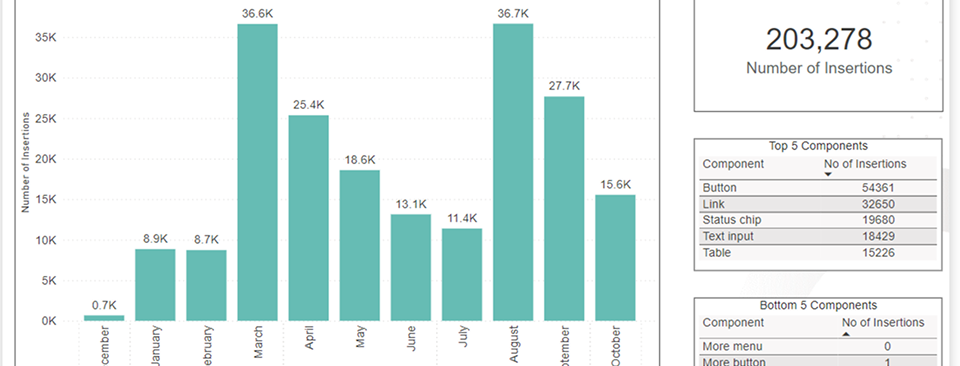
I developed an analytics dashboard in Power BI that visualised key metrics from Figma and other sources, including:
- component usage rates,
- frequency of variations inserted,
- areas where unused components were contributing to slower prototypes.
This data revealed that over 60% of component variations were unused, which was negatively impacting file performance.
Outcome
With data-driven insights, we removed unnecessary variations (such as redundant theme sets) and improved prototype performance by nearly 30%. The dashboard now provides ongoing visibility into system health and supports prioritised improvements.
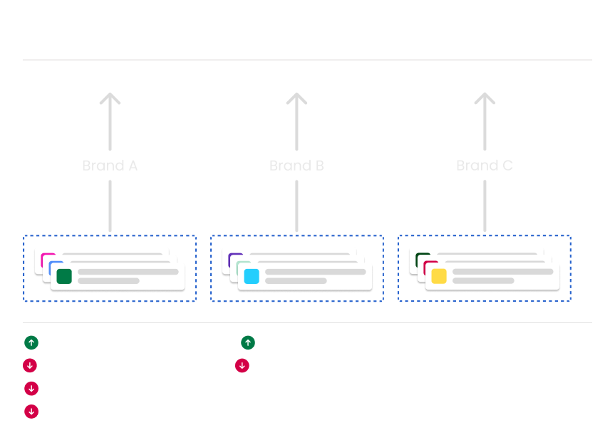
Multi-Brand System Structure
Challenge
BPP’s products spanned multiple brands, each with a distinct visual identity, but prior token systems did not support scalable differentiation without fragmenting the system
As part of an executive objective, we needed to:
- Create a shared foundation that could scale to multiple brands
- Enable brands to express their visual language, in a controlled and scalable system.
- Improve consistency, efficiency and overall quality across products.
Approach
Our pre-existing token structure meant that each brand would not be able to apply their visual language on our components. Acting as the sole design system representative, I led stakeholder conversations to demonstrate why a multi-brand design system was essential for scalability, consistency and efficient delivery across products.
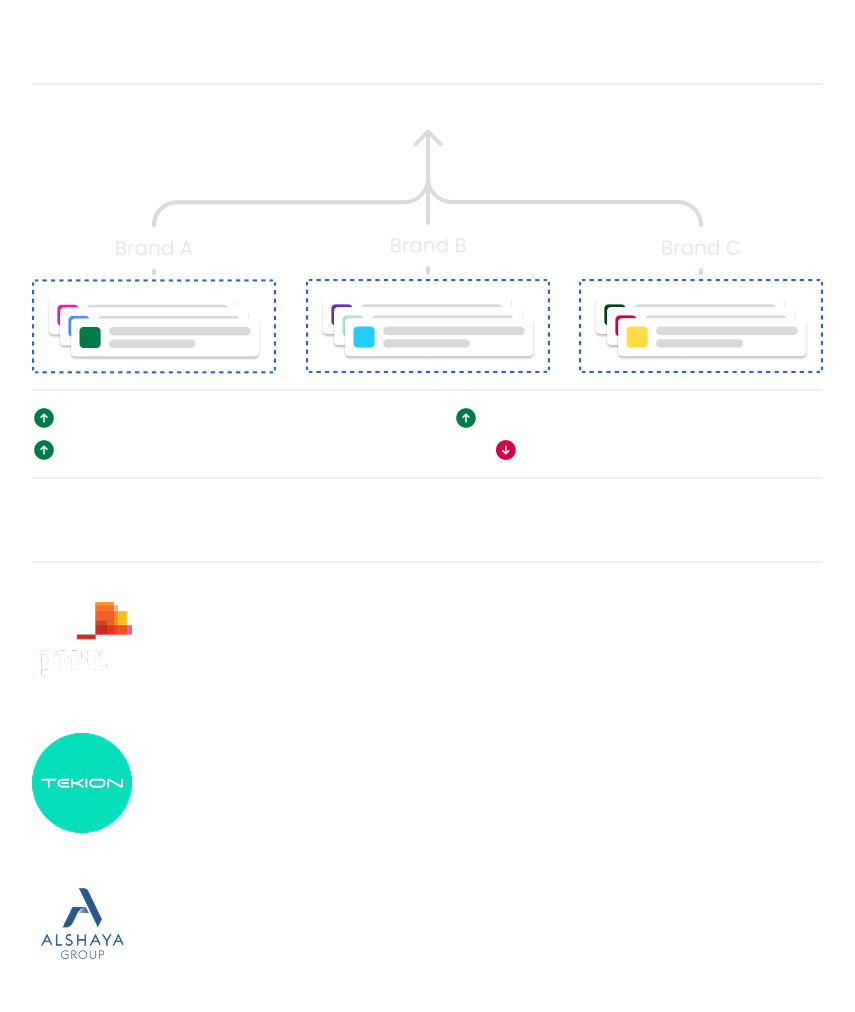
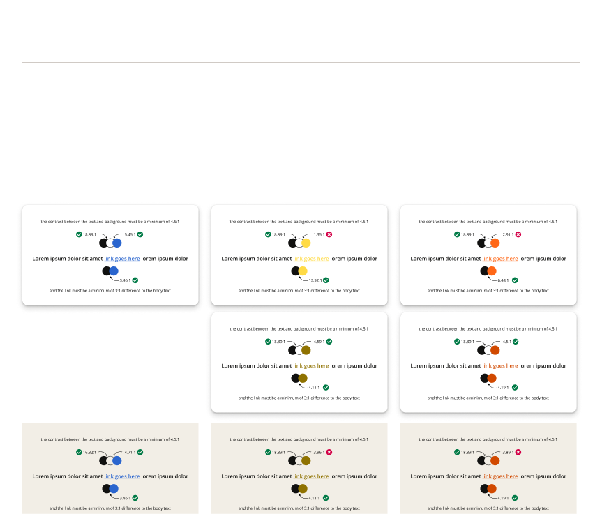
Tokens Restructure:
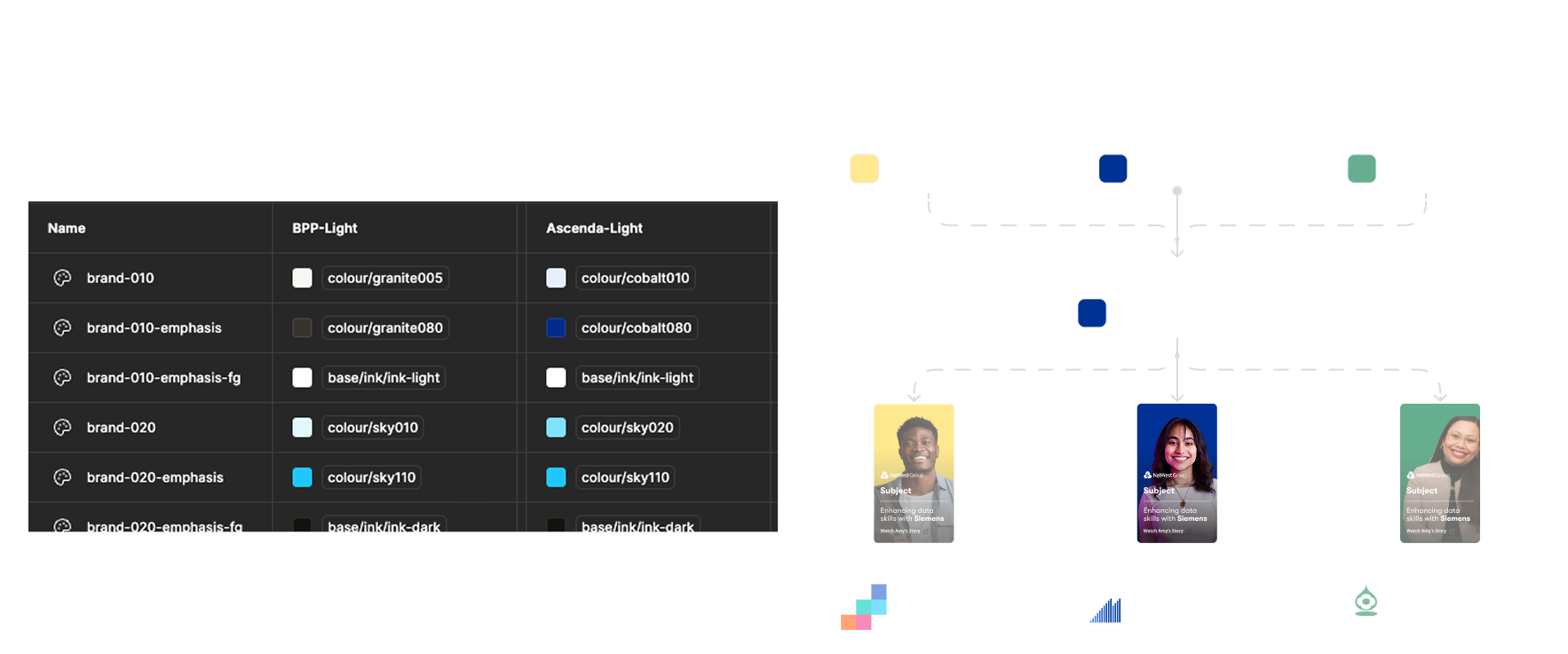
I restructured design tokens to allow brand-specific visual language while maintaining a shared component foundation. This involved close collaboration with marketing and brand teams to align colour and accessibility standards.
Token Value Exploration:
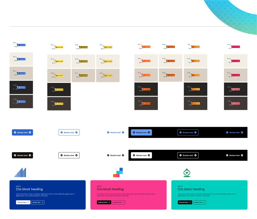
Outcome:
The updated system allows components to adapt to different brand identities without duplication. This reduced maintenance costs, supported faster delivery of new features and ensured visual consistency across brands.
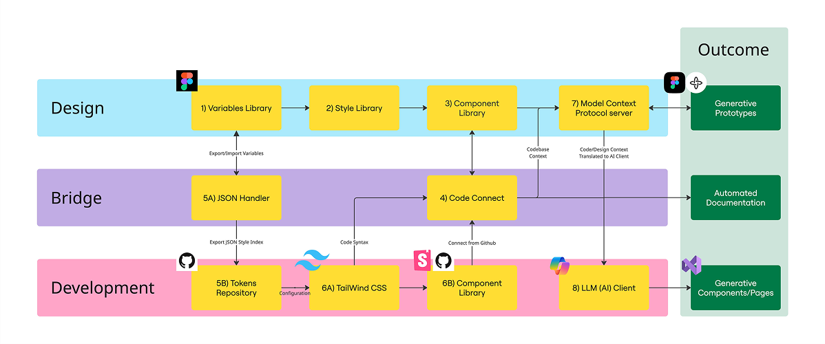
Design to Development Workflow (In Progress)
Challenge
Communicating design intent to engineering teams was inefficient, with naming discrepancies and unclear component sources creating extra time and cost required to evaluate, resolve and release issues associated to mistranslated context.
Approach
I assessed existing architecture and proposed improvements that would standardise naming conventions, centralise documentation, and explore tools like MCP servers to bridge design and code more seamlessly.
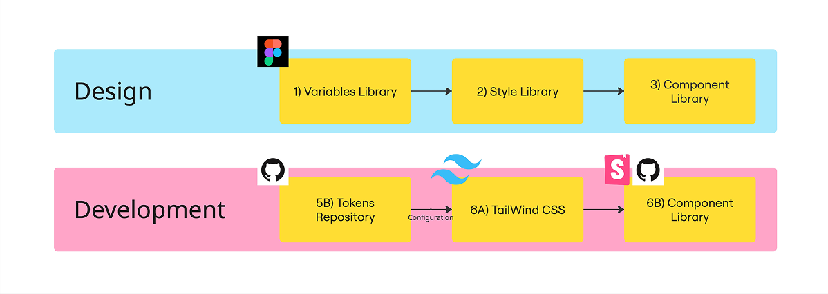
Proposed Outcome
After the investigation, I evaluated the extensive tools that were available. The biggest challenge posed was finding tools that would not require a dramatic change in the way in which designers and developers worked, as this would cause extensive educating and time to existing projects. The Model Context Protocol (MCP) Server extracts design context (variables, layout, component info) and feeds it to AI tools such as Co-Pilot into a IDE such as VS Code. This enables Generative AI to produce components, sections, and pages that match our design system. Prototypes built in Figma Make can be interpreted by MCP and AI to generate production-ready code.
I'm currently proposing this structure to enable MCP servers to communicate with AI tools used by developers to produce consistent and accurate outputs of components. Reducing QA effort, bug fix tickets and saving time/effort on design system related tickets.